The CurrCon Java Applet displays prices on this
web page converted with today’s exchange rates into your local international currency,
e.g. Euros, US dollars, Canadian dollars, British Pounds, Indian Rupees…
CurrCon requires an up-to-date browser
and Java version 1.8, preferably 1.8.0_131.
If you can’t see the prices in your local currency,
Troubleshoot. Use Firefox for best results.
Small bit-map pictures, in Java, in the form of
*.png and *.gif files and in
Windows, in the form of *.ico files. Java does not directly
support animated gifs, though some people have written animated *.gif viewer code. Java stores its icons in C:\Program Files\java\jre1.8.0_131\
\lib\resources.jar. For the best look, you need to get all your icons from the
same source, or the same artist in the same style. This is considerably more
expensive than creating a patchwork as I have done scavenging icons off the web.
Windows *.ico files contain several different resolutions.
You can create them from individual images with IconLover. Java does not support them. Apple’s equivalent
to *.ico file are *.icns files.
Icons used to intentify posters on forums are called avatars.
Avatars can be registered centrally so you don’t have to set them up on every forum.
When you do that, they are called gravatars.
Programs should be designed with user-configurable
icons the way Opera is. There should be a
central library of icons that artists can contribute to. There needs to be a tool
where you can specify the icons you need and it finds some icon sets that cover them.
Eventually icons may become an international language that could be used to
communicate anything visually much the way Ameslan can be used by deaf speakers to
communicate internationally. Icons need to be treated more like fonts, where the
user’s preference is paramount. Home stereo equipment is easier to use because
of icon standardisation. The same needs to happen for computer programs. However,
computers also offer user configurability, so that the user can decide what icon he
wants to use for what function in all applications. This requires
standard icon names.
With the advent of hover help (aka tooltips), it is much less important that you
can glean the secret meaning of an icon just by looking at it. What is more important
is that you can tell it apart from the other icons with just a glance. Icons should
be bold and clear, not fussy little portrait miniatures. People with less acute
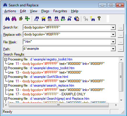
eyesight need simpler icons. An example of poor icons is Funduc Search/Replace where every icon looks like pair of
binoculars unless you stare at it closely. For examples of good icons look at some of
the award-winning Opera button sets.
The other problem with icons is aesthetic. If you design icons in isolation, then
lump them together on the screen, they will look like the equivalent of a ransom
note. They need some unifying themes. Professional artists know how to get the right balance.
Most icons are only 32 × 32 bits. You must use a
considerable amount of anti-aliasing in your designs to get clear looking images.
I am quite astonished that very few companies have created a corporate icon to
represent themselves compactly in web references on other people’s sites. I
suggest that every company should create a corporate icon, in 16
× 16, 24 × 24, 32
× 32, 64 × 64 and 128
× 128 format, a corporate logo in 128 ×
48, 256 × 48 and 384
× 48 format and a corporate banner in 400 ×
40 and 468 × 60 format and post them on their
website for others to use in sending them business. By providing icons in these
standard sizes, the logos of other companies will nicely line up when displayed with
the logos of other companies. There is less need to standardize on formats or colour
depth. It is easy enough to convert the logos to the same colour depth and recording
format. Now where is that round TUIT in need to create such logos for myself?
There also needs to be a scheme to automatically propagate new versions of the
logos.
There are three theories of icon design:
They are miniature realistic pictures from which you should be able to
distinguish completely the meaning without any hoverhelp or documentation.
They are buttons that can have totally abstract symbols on them. Their main
function is to provide functionality in minimal screen real estate. You mainly want
them easily distinguishable without close study. You should be able to hit them
almost with peripheral vision. Colour-coded blobs would do just fine.
They are artistic decoration for the application.
Now with PLAF it should be possible to
ship apps configurable to optimise for any combination of the three design concerns.
You can test your icon designs for the visually challenged by seeing if you can
tell them apart reading them from across the room. They can contain detail, but the
detail must not be significant. Such icons are more efficient for people with normal
vision too, though they may not look quite as elegant.
I find grouping icons helps a lot rather than just placing them in long rows or
blocks.
Editing Icons
*.ico files in Windows have a peculiar
format that allows you to pack several variants of the icon in the same file. You
need specialised editor programs to edit them. One comes bundled with Microsoft
Visual C, but it comes without instructions. It keep changing colours on you
unexpectedly, with no easy way to control transparency. They typically contain 16x16,
24x24, 32x32, 64 × 64 and 128
× 128 format all packed into one *.ico file.
Sometimes one or more of the resolutions are left out.
Icon designers are overly fond of blue. This means the icons are hard to tell
apart in small sizes. You can either modify the colours, or replace them entirely
with icons you find with Google image search. Just right click
properties on the shorcut to replace the *.ico file.
Icon XP/Icon Lover
Icon XP is only
It can do anti-alias smoothing, smooth scaling, spline curves, alpha channel. It
works on *.ico, *.gif*.jpg and *.png images both square and
rectangular. It has the usual paint functions. Its main weakness is converting high
colour to 256 colours. It does not know how to do the octree algorithm to select the
optimal set of colours. Once you place something it is fixed. It does not maintain
the entire image as a set of movable vector objects. The undo tends to jump back a
great many steps. You get a great improvement in your icons just by loading them,
converting to 32-bit alpha channel and clicking smooth,
and perhaps adding a drop shadow.
It is missing a useful simple feature, the ability resize to 50%. You must
calculate the image size width and height yourself. To use the smoothing function,
you must turn on high-colour and alpha-channel. It does not seem to have a way to
reduce the colour depth and maintain alpha-channel transparency. The more I used it,
the more I liked it. I own a copy.
Axialis
Axialis makes an icon
editor for
. That is for the full corporate version. The
personal version for
may not be used by companies and has some features removed.
Axialis supports formats from 16 × 16 up to
256x256, allowing you to pack multiple versions of the icon in the same file. Axialis
also lets you control transparency along with colour. This lets you create
transparent icon has blend nicely int backgrounds of any colour. It lets you export
icons as transparent png files so you can use them in
Java or HTML (Hypertext Markup Language).
The most magical thing it does is the way it resizes. The resized images look very
sharp because they are anti-aliased. Axialis uses automatically computed blended
colours to give the illusion of finer resolution than is really there. See my
moose icon in many resolutions done by taking a
*.gif and feeding it to Axialis without any touch up. You
can also get it to compute drop shadows to give the icons that soft XP look. It is
specialised for icons. You can’t even edit images. It will generate all the
smaller layers automatically if you create the big image. It does not have any of the
special effects of Photo Shop or Paint Shop
Pro. It has a library of image objects, you can combine
to create icons. It creates install bundles so you can sell collections of your
icons. It does not let you resize a document by percentage, but at least it will
optionally maintain the aspect ratio. For such as expensive slick-looking program, it
is missing features you would expect such as:
Ability to export all the composite png images of an icon in a single
command.
Ability to edit general png images.
Ability to add colourise to a black and white drawing, though you can change
the hue of a colour image.
Magic Wand to find a region with similar colours.
Ability to edit the palette map.
Ability to replace one colour with another. I fooled around for 30 minutes
unable to get the feature to work.
Various transforms to create 3D effects like those in PaintShop Pro.
Automatically update the smaller images when you edit the big one. I found I
had to delete the small images and recreate them to get it to notice the changes to
the big version.
The undo feature does not always work by hitting Ctrl-Z the
way it does in most other programs. You have to click the undo icon.
Preview test on various backgrounds.
I has a huge number of control buttons, but when you get down to it, the program
does not do much.
Tips
In Windows 10 the task bar at the bottom of the screen is solid black. Any icons that are primarily
black will disappear against this background. So avoid black icons.
The icons directory is a special reserved directory
for Apache web servers used for providing Windows-style icons for files it serves.
So don’t use that name for your own files.
Don’t attach your icon to a program until it is in
its final form. I find it quite difficult to replace the icon with another. Old
versions seem to get stuck in cache and it takes a reboot to clear.
When you buy icons, make sure your license allows you to include them in your
distributed software and/or on your website.
Wikipedia has large
national flags in png and svg
format. You can use at tool like IconLover to resize them to whatever you need.
The
Iconshock people have a clever promotion. They will send you a random sample of
free icons every 15 days to do with as you please in
return for you advertising them with a text or banner link on your website. You
are allowed to trade these icons with others. You have to take quite difficult
vision and typing and ESP (Extra Sensory Perception)
test to be allowed to participate. Read up on validation codes to learn how to cheat.
777icons.com: (aka Aha-Soft)
will create custom icons for about
each. This is quite a time consuming process, to get the icon just the way you
want, so don’t leave it to the last minute. Leave at least a month. I
discovered they outsource the work to the Ukraine. They make the icons with
Xara and correct them in Adobe Photoshop.
Each individual size has to be manually corrected; that’s why it costs
extra to get the extra resolutions and why larger resolutions cost more. There
are more pixels to correct. 777icons works out of Krasnoyarsk Russia. I found
them agreeable, friendly and flexible. I got them to create 5 custom icons and I
also bought ready-made icons from them.
The job of a large icon is to please the eye. The job of a small icon is to
rapidly guide you to press the correct button. You should not have to look
carefully at it to use it. It should have minimal detail.
You can’t draw at icon at one size and simply scale it to another size.
Some of the problem include:
Lines shrink so thin you can no longer see them.
Details blur so all you see a smudge. Smaller icons need to a simpler
design, more symbolic and less realistic.
In large icons, large areas of white space looks fine. In small icons it
looks ridiculous. You can’t afford to waste space on non-informational
bits.
Small icons may require a bolder colour scheme to make the parts of it
distinct, to make it recognisable at a glance. Icons are not pictures, they are
labels for things. Think about the simple, clean, symbols used on appliances.
They have to be recognisable with your peripheral vision, without being so
stylised they become cryptic. I have proposed a better set of icons. Perhaps you might have more
success than I at convinting the author to upgrade them.
When you are designing/proofing an icon, look at it in all the resolutions.
You might want a simpler more stylised image for the small sizes.
Think about the nearby icons. You simultaneously want them to have a
unified style, but should be easy to tell apart even with a casual glance.
Funduc Search/Replace is a
classic example of violating this principle. Even after over decade of using it
I have to study each icon carefully before clicking to tell them apart. To help
confuse you, nearly every icon contains the same visual element, a pair of
binoculars. The crucial differences are in microscopic type.
Rant
Common mistakes people make in designing icons include:
Making them too small. With today’s ultra-high res screens, icons that were years ago a reasonable size are now too tiny to see.
Making them too busy. Some people draw tiny miniature pictures that tell a story. You can’t tell them apart without a magnifying glass and ten minutes study.
You should be able to tell them apart with just your peripheral vision. They should be bold and simple.
You will be poking at them with your mouse without
necessarily staring carefully at them.
Icons should be distinct from each other, even with the most casual glance. You must use both shape and colour since some people are colour blind.
If an icon has a toggled state, make that alternate state distinctly different using a consistent convention.
The common error is to make icons too realistic. They should be stylistic. All that detail just slows down recognition.
There is no pleasing everyone. Ideally you should make icons configurable/replaceable. You shold be able to configure fonts and sizes and you
should be able to configure the colour scheme, or parts thereof.
Generating Button Images
You can generate images to use for buttons several ways:
With a mathematic rendering utility such as Pov-Ray.
With a button generating utility such as
.
With an online button generating service such as:
.
offers some of its button patterns free, but only for a limited time. If you need
more buttons of the same style later, you will have to pay
.
Keep notes of the parameters, sizes, colour numbers etc that you used to create
a button in case you need to make others in the same family or change the
wording.
When you make buttons, make extra buttons with wordings you might use in
future. It is much easier to crank out an extra button than to come back later and
try to figure out how to crank out a button that looks like an existing one.
If the lettering on the button looks too cramped, try adding a space between
each letter like this:
CMP (Canadian Mind Products) Free Icons
I commissioned the Aha-Soft artists to create the following 6 icons. They come in sizes from 16
× 16 to 256 × 256 in both png and ico format. You may download the entire suite of sizes and formats
and use them as you please.
Icons you may use freely
Icons You May Use Freely On Your Own Website and in Your Own Applications
a winged coffee bean being launched by a spring. It suggests whimsically launching the Java app into the air, like launching a rocket. You might use the icon for the .jnlp extension. I use this icon to represent Java Web Start
Oracle’s public domain Duke character dressed as a full-figured carpenter carrying a tool kit containing a saw. You might use the icon for the .java extension. I
use this icon to represent the JDK .
Oracle’s public domain Duke character as a runner, stripped down and lean, to suggest the bare essentials needed to run Java applications. He is wearing a yellow jersey, suggestive of
the yellow jersey worn by the front runner in la Tour de France bicycle race. You might use the icon for the .class extension. I use this icon to represent
the JRE .
woodpecker
Woodpecker. I am not sure what precise species this one is supposed to be. It looks a bit like a golden fronted woodpecker. The image was only intended to represent a generic woodpecker.
Check out whatbird.com search for excellent bird illustrations to help you identify species. I use this icon to represent
unmaintainable code.
If builders built buildings the way programmers write programs, then the first woodpecker that came along would destroy civilization.
~ Weinberg’s Second Law(1933-10-27 age:84)
blue whale
This is a blue whale, the largest animal that ever existed. I use this icon to represent animal rights.
There are various programs that will extract icons from
Windows exe and dll files.
Unfortunately, they don’t usually let you modify or replace the icons. Further,
they can only extract the ico format resources, not the
png, gif, jpg, svg and other icon formats.
Please read the feedback from other visitors,
or send your own feedback about the site. Contact Roedy.
Please feel free to link to this page without explicit permission.
Canadian
Mind
Products
IP:[65.110.21.43]
Your face IP:[216.73.217.43]
 777icons.com: (aka Aha-Soft)
will create custom icons for about
each. This is quite a time consuming process, to get the icon just the way you
want, so don’t leave it to the last minute. Leave at least a month. I
discovered they outsource the work to the Ukraine. They make the icons with
Xara and correct them in Adobe Photoshop.
Each individual size has to be manually corrected; that’s why it costs
extra to get the extra resolutions and why larger resolutions cost more. There
are more pixels to correct. 777icons works out of Krasnoyarsk Russia. I found
them agreeable, friendly and flexible. I got them to create 5 custom icons and I
also bought ready-made icons from them.
777icons.com: (aka Aha-Soft)
will create custom icons for about
each. This is quite a time consuming process, to get the icon just the way you
want, so don’t leave it to the last minute. Leave at least a month. I
discovered they outsource the work to the Ukraine. They make the icons with
Xara and correct them in Adobe Photoshop.
Each individual size has to be manually corrected; that’s why it costs
extra to get the extra resolutions and why larger resolutions cost more. There
are more pixels to correct. 777icons works out of Krasnoyarsk Russia. I found
them agreeable, friendly and flexible. I got them to create 5 custom icons and I
also bought ready-made icons from them.