It aims for maximum legibility by making all the letters as distinct as possible, which, of course, makes it good for everyone. Tiresias was the blind seer of classic Greek literature. It looks like this:
![]()
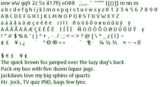
Note how well Tiresias discriminates between commonly confused characters:
If you already have it installed, all the type on this page will look similar. It is the default font for my website.
It comes is several variants: PCFont is for people with poor vision to use on PC (Personal Computer) screens using large characters. Screenfont is for TV screen captioning. Infofont is for public terminals such as ATMs (Automated Teller Machines) using large characters. Signfont is for preparing signs for the visual impaired.
Just click on the font name to download.
If the font is installed, the sample text will show up in that font. If the font is not installed it will show up in a spindly vector font.
| Tiresias Infofont [0] free font for information labels. |
Tiresias LPfont [0] free font for large print publications. |
Tiresias ScreenFont [0] commercial font for TV subtitles. |
| Tiresias Infofont Z [0] free font for information labels. |
Tiresias PCfont [0] free font for computer screens. |
Tiresias Signfont [0] free font for signs. |
| Tiresias Keyfont V2 [0] free font for labeling keycaps. |
Tiresias PCfont Z [0] free font for for computer screens. |
Tiresias Signfont Z [0] free font for signs. |
You can buy download free versions of the Tiresias famil.
My main complaint with ScreenFont is that O and 0 are not distinct enough. The Tiresias fonts with a 'Z' after their names distinguish between the 0 and O by crossing out the 0 (zero). The letters have quite conventional shapes, unlike my proposed Proofreader font which has a similar purpose. The other problem is left and right quote look the same: “”.
The kerning in TiresiasScreenFont needs some work. Combinations like CO CC CP CE are hard to make out because the letters are too close together. These errors don’t cause much trouble except in Forté Agent Newsreader where they cause the rendering to sometimes go so totally screwy that you can’t continue editing.
The creators of the font has this to say about my complaints with the font,
Tiresias Screenfont was originally designed for subtitling use on digital television. It was designed for legibility at television viewing distances and constrained by space and resolution. So due to the scaling restrictions on TV screens, it was not designed for the intention of ever being used at small point sizes. We are aware there are a few kerning pairs (spacing between letter combinations) that still need rectification so we have noted your suggestion.
~ Tiresias Designers
I highly recommend downloading a free copy of Tiresias PCFont Z and using it as your default proportional font. It makes working with a computer so much more relaxing. I can’t think of a cheaper investment that has such high returns in comfort. You can download them from this site just by clicking on the name of the font above.
Unfortunately, the fonts are available only in TrueType format. They are locked, so even though they are public, they cannot be converted to other formats.
The Tiresias font does not do superscripts or subscripts well. I flip to another font for them.
This page is posted |
http://mindprod.com/jgloss/tiresias.html | |
Optional Replicator mirror
|
J:\mindprod\jgloss\tiresias.html | |
Please read the feedback from other visitors,
or send your own feedback about the site. Contact Roedy. Please feel free to link to this page without explicit permission. | ||
| Canadian
Mind
Products
IP:[65.110.21.43] Your face IP:[216.73.216.91] |
| |
| Feedback |
You are visitor number | |