PragmataPro is an excellent programmer’s font from font designer Fabrizio Schiavi in Italy, the creator of the earlier Pragmata Programmer font. Have a look at the following font samples, especially the lookalikes section. He has done a remarkably good job of making those characters look distinct. I don’t think I have ever seen another font with that much difference between characters. He took my criticism of his earlier font to heart and made the 0 and 8 distinction particularly clear. In ordinary English, it is fairly easy to tell by context what letter is intended, but in programming, intention is not important. What counts is what the letter actually is. Computers are not interested in intentions.
The italic a and o look a little too much alike. He said he would fix that. The italic version does not yet have hinting. The main way you notice that is the italic equals the top bar looks noticeably thinner than the bottom. A fix for that too is coming.
If you buy the font, you can only use it on your desktop computer. You may not use in on your website..
| PragmataPro plain | PragmataPro bold |
|---|---|
 |
 |
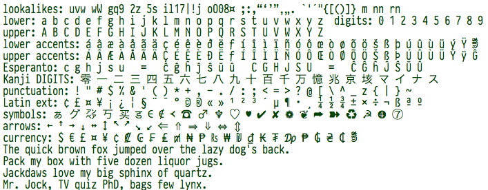
Also notice that it also handles the obscure punctuation, Esperanto, Kanji, symbols, arrows, currency symbol, accented letters, Hebrew, Arabic, Cyrillic, Bopomofo (phonetic Chinese), Greek, East European, old German Fraktur (beloved of mathematicians), APL (A Programming Language), Agda (an obscure programming language with its own symbol set), phonetics, box drawing… Even the obscure Esperanto accented letters are in same style as the main ones, not borrowed from another similar font as is sometimes done.
It is hand designed and hand-hinted. It is not particularly beautiful, but it is highly legible and compact, both horizontally and vertically.
Unfortunately because of the limited market and years of labour to create it, PragmataPro is quite expensive. You can buy the Complete font for from FSD or get just the essentials (reduced character set, no italic) for .
I am using PragmataPro myself for general text editing and in the IntelliJ IDE (Integrated Development Environment). When I sit back and look at a wall of text, it looks hard to read, too cramped, but when I read any individual sentence, it is very clear. I don’t need to take off my glasses over and over for a closer look to be sure of the precise text. It is just obvious what it says without any strain. I have been trying to think of some analogy to describe the subjective feel of the type. It is a bit like a goat, very definite, clear in its purpose, practical, unambiguous, not in the least wispy. It is not a particularly beautiful font, but a very workable font. Because it is a such a compact font, you can increase the size and still get more visible per page, while simultaneously increasing legibility.
This page is posted |
http://mindprod.com/jgloss/pragmatapro.html | |
Optional Replicator mirror
|
J:\mindprod\jgloss\pragmatapro.html | |
Please read the feedback from other visitors,
or send your own feedback about the site. Contact Roedy. Please feel free to link to this page without explicit permission. | ||
| Canadian
Mind
Products
IP:[65.110.21.43] Your face IP:[18.226.177.223] |
| |
| Feedback |
You are visitor number | |