
A presentation given by Dr. Thomas Homer-Dixon to the CIC (Canadian International Council)
2008 National Foreign Policy Conference in Toronto. Watch the
video
![]()
Well, I actually decided that I liked the earlier title better because I think It’s actually a much more important question. I think the word sustainability is almost unserviceable now. I don’t think it has a lot of content.
It also, perhaps, to the extent it has any content, is somewhat misleading because it implies that we can find some kind of nice sort of glide path where we can tweak things carefully and maintain or increase human well-being more or less indefinitely into the future. It implies somehow that the systems that we live within — the resource, environmental and economic and social and technological systems — are easily managed — or, if not easily managed, that we can manage them; that we understand them well enough that we can find that glide path, or that flight path and maintain it indefinitely.
I am increasingly convinced that it is complete folly to believe that we can do that kind of thing. Inevitably, human affairs involve constant adjustment, constant recreation of one’s perspective on the world and response to crisis. I am absolutely convinced that the challenges of the Twenty-First Century will be among the most severe that humankind has ever faced and that we are going to have to be very nimble and very creative and very responsive in approach during that time.
I think the real question becomes: how serviceable are our conventional ways of looking at the world, our conventional scholarly and academic apparatuses and theories, in allowing us to understand the challenges we face and what we should do about them? 3:03
So I think in the end this is a much more interesting question and my answer is provisionally is: Are radical measures necessary? You bet and every day we wait, the more radical they are going to have to be. I want to explain why I think that’s the case, over the next few minutes. 3:21
We have seen a number of these in the past — for instance, the rollout of railroads across North America, the development of the internal combustion engine, the electrification of our economies and more recently the development and diffusion of the personal computer. In each one of these cases, you saw a surge of investment, an enormous process of creative destruction, as some industries simply disappeared and other ones were created. There was a terrific opportunity for entrepreneurship and innovation, but there was also terrific hardship and disruption and economic crisis in certain sectors. 4:40
I think that the real question for us in the future, the real question for Canada, is whether we are going to be one of the leaders of this transition — which could be of a magnitude much greater than any of those previous GPTT transitions — or whether we are going to once again, as so often has been the case in the past, be a follower. I would like to see us be a leader. We have everything it takes for us to be a leader, but we are very rapidly choosing the path of being a follower.
So I will go through a few ideas in the future, especially some of the places where Canada could be specialising in technological innovation, where I think Canada could really make a mark. 5:24
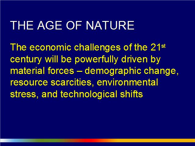
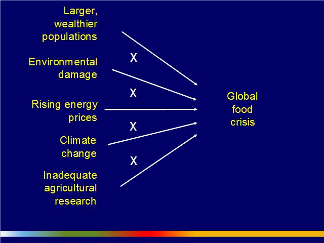
But first let me spend some time talking about the nature of the problem we face — the magnitude of the problem and challenge we face. [I have a laser pointer here which is about the size of a brick, the whole Russian technology.] I think we will look back, or historians will look back, at the end of the Twenty-First Century and say that the Twenty-First Century wasn’t the age of biotechnology or the age of nanotechnology or some other thing like that. But they will say that this was really the age of Nature, that this was the century in which we were reminded powerfully, perhaps very hurtfully, that Nature matters in every aspect of human well-being — that we are fundamentally dependent upon the services and goods provided by the natural world, the resources and environmental products of the natural world. The economic challenges of the Twenty-First Century are going to be powerfully driven by these material forces — demographic change, resource scarcities, environmental stress and technological shifts. 6:39
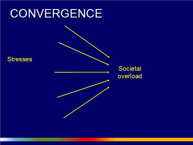
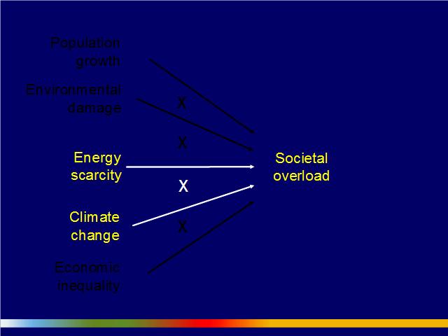
But that’s not the end of the story, or even the beginning because the challenge we face, I think, most fundamentally is one of multiple things happening simultaneously, a challenge of converging stresses. If we look at the instances of major social trauma and turmoil like the great revolutions of history — the French Revolution, the Russian Revolution and more recently the Iranian revolution — research shows that those societies ran into trouble and the states collapsed in significant part because they were hit by multiple shocks simultaneously, multiple stresses simultaneously, that produced a situation of institutional overload. The coping capacity of these societies wasn’t sufficient for the stresses that they faced. And I’m increasingly concerned that that’s the circumstance that we face right now in the world, that we are creating a situation of potential global societal overload. 7:38
Here are some of the things that I think are converging on us. I sometimes say it’s a bit like we’re standing in the middle of a large parking lot and we look out as we see that there are ten Mack trucks approaching us simultaneously, barrelling down towards us. We look at one and we see across the front bumper climate change. We at look at another and we see across the front bumper energy. We step out of the way of one and we look over here and there is another one coming at us. That is, I think, an enormously dangerous situation. 8:09
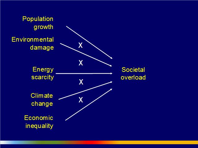
Here are some of the things I have highlighted in my most recent work. One of the points that I want to emphasise with this slide is captured by those little multiplication signs. These factors tend to reinforce each other. The whole is more than the sum of the parts. You are getting synergies, interaction effects, among these problems that make them collectively harder to solve.
It would be really nice if we could just do these things consecutively: oh, we’ll deal with the energy problem, then we’ll deal with the economic inequality problem and maybe pick up a bit of climate change on the side. But it turns out that we’ve got all this stuff going on simultaneously. I’m going to focus on two of these challenges, energy scarcity and climate change, over the next few minutes.
When it comes to climate, something significant has happened in the last three years; in fact, in major part, since the release of the — excuse me, I have to get this right — since the guillotine came down on the science that was included in the latest round of IPCC (Intergovernmental Panel on Climate Change) reports. Now, that deadline was the middle of 2005.
That turns out, in terms of climate change science, to be a long time ago and a lot of things have happened since then. We have about three years more of data and even though the IPCC reports were released at the beginning of last year (2007), they were already in significant part out-of-date by the time they were released. In that period of time, over that last three years, climate scientists have shifted their perspective significantly. They have moved from a perspective of, I think, generally regarding climate change as a matter of significant concern for humankind to now regarding it as a matter of grave urgency.
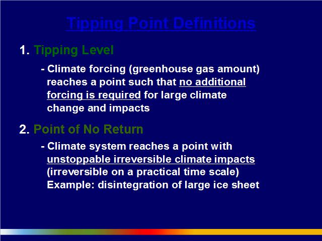
A significant proportion, a large proportion, of climate scientists now believe that we are close enough, potentially, to a tipping point at which the biosphere and the climate system could start on its own to release very large amounts of carbon. We may only have, say, 5 or 10 — at the outside, 20 — years to turn this ship around and start ramping down carbon emissions globally, very quickly. 10:23
There are points that I want make about climate in my comments here:
But first of all, let’s talk about where we are right now.
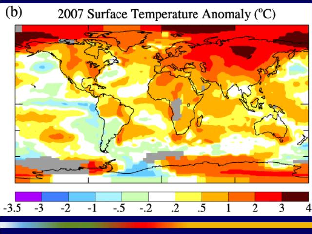
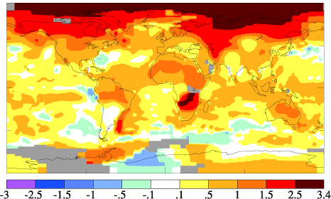
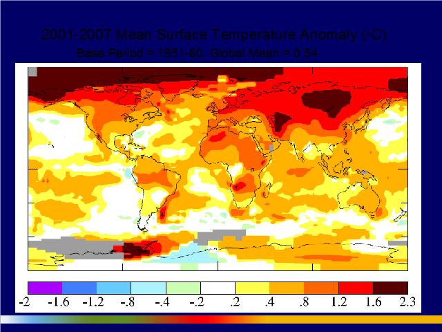
What we’re looking at here is a NASA (National Aeronautics and Space Administration) map, a Goddard Institute map, of warming in 2007. This is relative to a 1951 to 1980 baseline. So each region in the world’s temperature in 2007 was compared to the average temperatures between 1951 and 1980. We see across the bottom a scale in Celsius from -3.5 to +4 degrees Celsius. 2007 was tied with 1998 as the second warmest year on record. 2005 was the warmest year on record.
Take a look at what’s going on in the northern part of the planet. This is relevant for Canada as a northern country. It’s warming much faster, for reasons that I will explain in a few minutes.
In terms of magnitude, we see across the inhabited portions of Canada warming in the neighbourhood of 0.2, 0.5, 1 degree and maybe in the prairie area 1 to 2 degrees Celsius.
That might not seem like very much, but keep in mind, in terms of the magnitude of warming, that if we compare current temperatures to the temperatures that prevailed on the planet on average [during] the coldest period of the last ice age, 15,000 years ago, we are only about 5.0°C (9.0°F) warmer than we were then.
By the end of the Twenty-First Century, the IPCC, according to its estimates, which I think are probably conservative… The IPCC predicts that the planet on average will warm around 3.0°C (5.4°F). And that is probably going to be the fastest warming that the planet has experienced in at least the last 20,000 years. 12:26
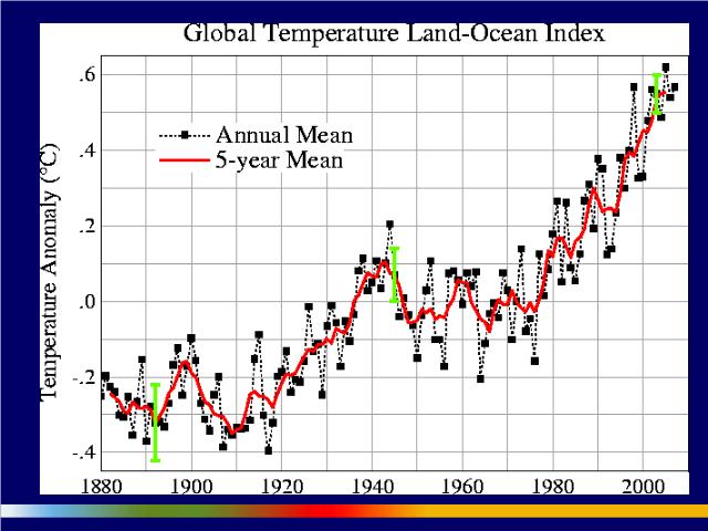
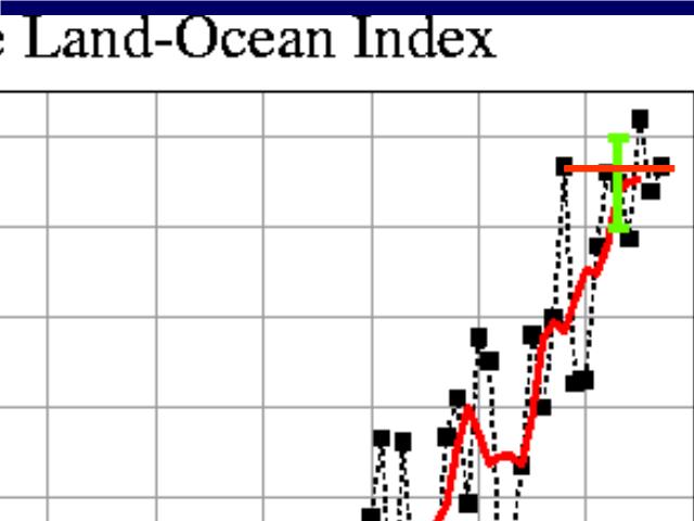
Looking back over what we’ve seen since the beginning, essentially, of the rapid industrialization of the world economies and the temperature record that we have going back to 1880 up to 2007, this is the kind of chart you see. This again is a chart by NASA-Goddard. Each square dot represents the mean surface temperature of the planet as estimated for that particular year. The green vertical lines are error bars that get smaller as we get closer to the present because the data get better. The red line is a five-year moving average.
You can see there is a lot of variation around the average. That’s because, on a year-by-year basis, the world’s climate is chaotic. It is especially influenced by ocean dynamics and especially by what are called ENSO (El Niño Southern Oscillation events) events, ( ).
As you probably know, there is a kind of sloshing of warm water back and forth in the South Pacific. When you are in an El Niño phase of the ENSO cycle, the planet tends to be warmer than average. When you are in a La Niña phase, as we are right now, of the ENSO cycle, the planet tends to be cooler than average.
1998 — which is right there — was, according to climate scientists, the most powerful El Niño phase of the cycle in about 100 years. This was a substantial deviation from the average in 1998.
Currently we are in a La Niña portion of the cycle, as I mentioned, which means that temperatures this coming year (2008) will probably not be a record high for the planet. 14:03
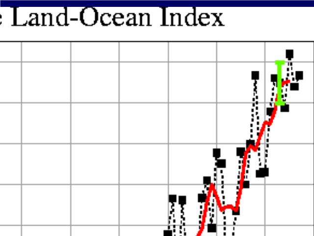
I want to point out, in response to an argument that is out there right now that focuses on what’s happened in just the last few years, that we are looking from basically 1998 here, 2005, to 2007. The argument that’s made frequently is that global warming has stopped because if you start your little line at 1998 and draw it to 2007, you can say that there’s no trend.
Well, when I talk to scientists about this… I did a little presentation at the Perimeter Insitutute, for instance, out at Waterloo and there was laughter in the audience because this is an elementary statistical mistake. In fact, it’s probably an outright statistical manipulation.
If you want to go back to this, you can draw straight lines at many places in this graph, if you pick your starting and ending points effectively. What you really need to pay attention to, given the chaotic short-term and medium-term nature of the global climate, you need to pay attention to the moving average over at least a five-year period. We can expect, therefore, that when we get into the El Niño phase of the global ENSO cycle, we will see much warmer temperatures.
By the way, this leveling out of warming is usually attributed to changes in the solar cycle, in particular the absence of sunspots. There are some people who claim that we’re into a long-term situation of no sunspots on the sun and therefore lower solar radiation and therefore cooling of the planets and as some people would say, yada yada. 15:45
I think it is important to know why this argument is not valid and to understand at the same time that we’re going to be hearing a lot of it over the next little while, especially if this coming year turns out to be relatively cool compared to other years. 16:01
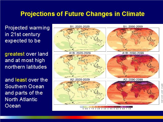
Looking out towards the future, the IPCC has produced a number of scenarios of potential future warming. These are based on scenarios of carbon emissions going out to 2100, which in turn are based on estimates of future global population size, patterns of use of technology, certain assumptions about what kinds of energy sources are used, estimates of fossil fuels and the like. 16:33
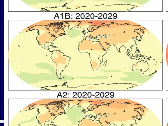
Here we have three of these of these scenarios: B1, A1-B and A2. A1-B has been considered in most of these discussions to be kind of modified business-as-usual — what the world will look like if we continue along more or less the track we are on now, with certain amounts of technological improvement, but no really aggressive attempts to deal with climate change. Across the bottom we have a scale from 0 to +8 degrees Celsius. I am going to blow up these two images here.
A1-B — As you can see, from 2020 to 2029 — somewhere around the 15 to 20 years from now — across the inhabited parts of Canada, we are looking at warming in the neighbourhood of 1.5°C (2.7°F) to 2.0°C (3.6°F)
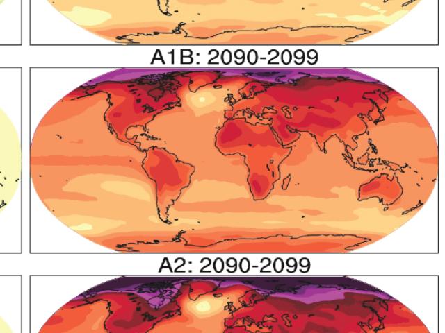
You get out toward the end of the lifespan of our grandchildren — at least, my grandchildren, whom I may never meet since I have two very young children at home, but their children are quite likely to be alive at the end of this century. And you are looking at warming in the inhabited regions of Canada in the neighbourhood of 4.0°C (7.2°F) and northern Canada in the neighbourhood of 5.0°C (9.0°F) and in the polar region 6, 7 to 8.0°C (14.4°F). 17:39
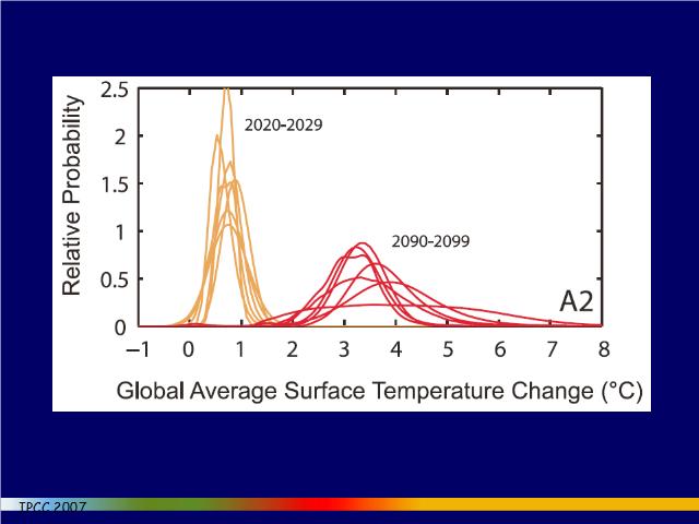
For some of the models, there is a suggestion of a significant probability that we could end up with warming not at the average of the models of 3 degrees — which, by the way, is what economists and many policy-makers are always pointing to — but warming of 4, 5, 6 or even higher degrees. This is what is called the fat tails problem.
Here are the fat tails — the higher tails of the probability distributions. I’ll come back to this discussion later in my presentation, but it’s important to recognise that according to much of the modeling, there is a non-trivial possibility that we could have temperatures at the end of this century much higher than 3.0°C (5.4°F). There is also, of course, a non-trivial possibility that we might end up in the lower fat tail, too. 19:09

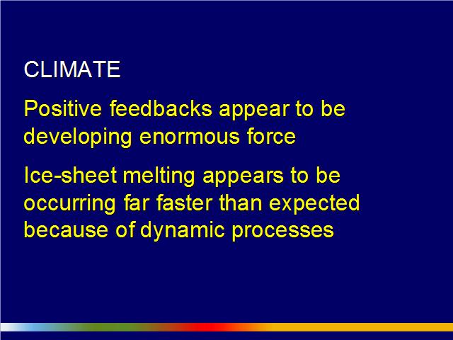
Let’s talk about positive feedbacks for a moment. Most of you probably know that a positive feedback is a causal cycle where a change in a system produces a sequence of changes that reinforces the original change. Positive feedbacks are fundamentally destabilizing. They take the system in a new direction, often towards another equilibrium of some kind.
You can contrast those negative feedbacks where a change in the system produces a series of changes that contradicts or counteracts the original change. These are equilibrating feedbacks. They are stabilising.
Much of the debate over the last decade, but especially over the last few years, in the climate science community has been over the relative prevalence of positive versus negative feedback. 19:54
There are many feedbacks in the climate system. Some of them we understand reasonably well. Some we don’t understand reasonably well. There are lots of negative and lots of positive feedbacks. The consensus that’s emerged in the last two years — and this is a very strong consensus now — is that the positive feedbacks on balance are more numerous and in aggregate more powerful, than the negative feedbacks — in fact, far more powerful. They serve to accentuate the impact of relatively small differences in trace gases in the atmosphere. That is why what appear to many people to be tiny changes in concentrations of carbon dioxide can have such a large effect on the global climate.
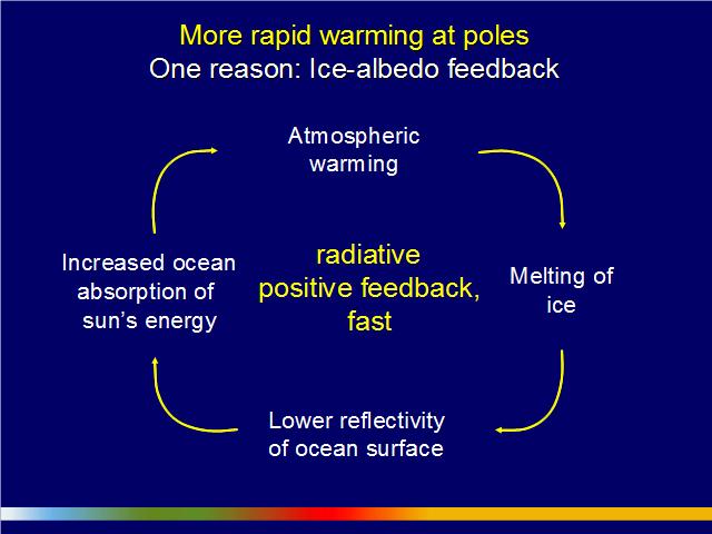
One of the most important positive feedbacks, but perhaps not the most dangerous to us, is a radiative positive feedback, the ice albedo feedback, that operates especially in the Arctic. This is one of the reasons the Arctic is warming so much faster than the rest of the planet. You have probably heard about this: as the Arctic ice disappears, it opens up ocean water. The open ocean water is dark to sunlight. It absorbs 80% more solar radiation than water covered by sea ice, highly reflective sea ice. And as the open ocean water gets warmer, it impedes refreezing of sea ice in the subsequent Arctic winter. The ice that does freeze is thinner and melts more easily the following Arctic summer. The result is a kind of vicious circle and more rapid loss of sea ice.
There are a bunch of positive feedbacks operating in the Arctic, we now realize. This is one of the most important and it’s probably contributing significantly to the rapid loss of sea ice. 21:39
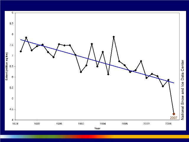
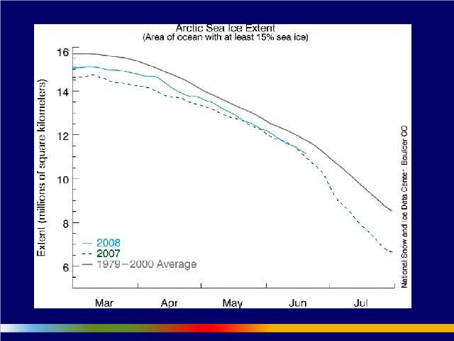
What we have here are data from the National Snow and Ice Data Center in Boulder, Colorado. Across the bottom, from 1978 to 2007. Up this axis, from 4 sq megametres (1,544,408.63 sq miles) to 9 sq megametres (3,474,919.43 sq miles) of Arctic sea ice.
As you know, I’m sure, you have a cycle of the extent of Arctic sea ice through the course of the year. During the summer it shrinks in extent and during the winter it expands during the Arctic winter. Each one of these little diamonds here represents the minimum sea ice extent for that year in the Arctic and that usually occurs around mid-September. This past year (2007) it occurred on September 16.
What the National Snow and Ice Data Centre people have done is, they’ve regressed a line between the data points from 1979 all the way down to 2006. In 1979, you had an area of extent of between 7 sq megametres (2,702,715.11 sq miles) and 8 sq megametres (3,088,817.27 sq miles). In 2006, we were down to about 5.30 sq megametres (2,046,341.44 sq miles), 5½ sq kms (2.12 sq miles). Then we saw last year (2007) this sharp divergence from trend. 22:53
I should tell you, I was in conversation, both directly and by email, with a number of climate scientists around the world when these data were coming out last August and September (2007), when we saw that dramatic drop in Arctic sea ice. This was a jaw-dropper for them. They were astonished. According to the models, that loss of sea ice shouldn’t have occurred for at least another 30 years and the IPCC implies that it should not have occurred for at least another 50 years.
So we are way ahead of where we should be. But it reflects the fact, perhaps, that what we are dealing with here is fundamentally a non-linear system. It is system that has the ability, as I mentioned before, to flip from one equilibrium to another equilibrium. We may actually be in the process of seeing over this year, last year and maybe the next couple of years a rapid and radical change in a major feature of the earth’s climate, which is the cryosphere, the system of ice at the north and the south of the planet. We may actually be in a process of seeing the disappearance, at least during the summer, of a majority, if not all, of the ice in the north. 24:01
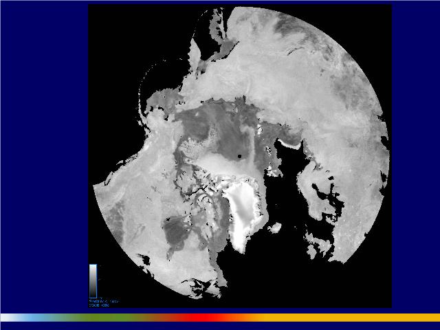
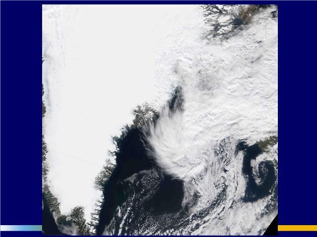
What are we looking at now? What do the latest data show? This a radar image of the Arctic from the middle of March, this past March (2007). Here we have Alaska, northern Canada, the Canadian archipelago, Greenland there, Siberia, the Bering Strait. This dark area, of course, is open ocean water. The darker grey is seasonal sea ice; that’s ice that’s refrozen, just this past winter. The light grey and white, crammed up against the northern part of the Canadian archipelago and along northern Greenland, is the last remaining multi-year or perennial sea ice in the Arctic. Normally that perennial sea ice would cover a much larger portion of the Arctic. What we have seen in the last 6 months has been an enormous flushing or evacuation of perennial sea ice from the Arctic.
I’m just going to show you what that has looked like, using the same kind of images, although with a slightly different orientation.
I hope you can see this. Here we have Greenland right here — that’s the east coast of Greenland and the west coast of Greenland — Northern Canada, Alaska here and Siberia. If you watch this date clock here, this is October 1, 2007. 25:28
Here we have the remaining ice after the minimum sea ice extent was reached in the middle of last September.
What I am going to show you is a video clip of individual images taken every day all the way up to March the 20th. I like you to keep your eye on this east coast and the west coast of Greenland and you’ll see the flushing process that I was just talking about. November… December… January… February… March…
What are we looking at now? This is the remaining perennial sea ice; this is seasonal sea ice in this region. If we have another summer approximating what we had last summer, where the meteorological conditions were a bit unusual… There was a lot of cloud cover over the Arctic. But if we have a reasonably warm summer without much cloud cover, we can expect that this ice will disappear and we’ll have open ocean water for the first time, at least in the scientific record, up past the North Pole.
I think that this could well be a galvanic event for the world, when this happens. Most people aren’t aware of what’s been happening in the Arctic over the last six months. In significant part, it’s happening because as the Arctic waters have become warmer, the Siberian high that usually sits right in this area has weakened and that has allowed winds to develop that have been blowing across the Arctic in this direction. Since the ice has been weakened by warmer water that has been coming up through the Bering Strait and eroding it from underneath, the ice has been easily blown by these new winds out and down, especially the east coast of Greenland. 27:12
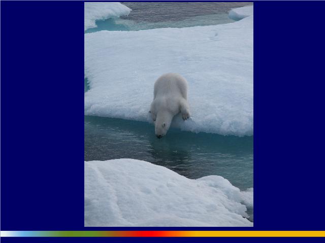
Now, this actually isn’t about polar bears. I know that earlier some people talked about issues of Canadian sovereignty in the Arctic and they’re important and worth considering. But I think issue of biodiversity, polar bears, I’m afraid Native communities, Arctic sovereignty, whether we’re going to get into a tussle with Russians over explorations for natural gas and oil and whether we’re going to be able to get tankers and freighters through the Northwest Passage, are all actually secondary or tertiary to the real concerns that should be on the table which relate to global weather because what we’re going to do if we lose the Arctic ice is, we’re changing an area above the Arctic circle that represents 9% of the surface area of the planet above the equator from a highly reflective surface to a high absorptive surface. This is going to have a big effect, potentially, on the energy balance of the northern part of the planet, perhaps the whole northern half of the planet and the weather patterns of the northern half of the planet as a result.
One of the concerns that scientists have is for these circulations that are called generically Hadley cells, which are vertical circulation in the atmosphere that you can see operating here.
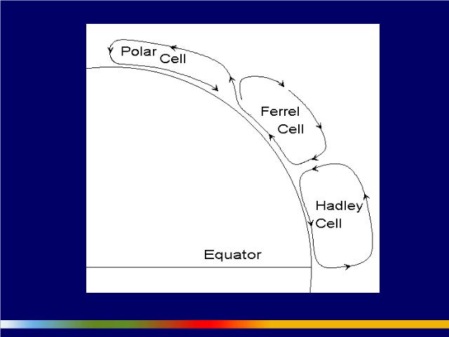
There are three of them: the Hadley cell at the equator, the Farrell cell in mid-latitudes and the polar cell. The polar cell sinks here. The atmosphere sinks here in large part because the pole is covered with ice and is very cold. This circulation, along with the Farrell cell, determines the path of jet streams. Jet streams tend to move down the interface between the polar cell and the Farrell cell. And, of course, the jet stream paths determine storm tracks, precipitation patterns very much further abroad and potentially things like food production a long way away.
I have asked a number of climate scientists about the implications of the loss of Arctic sea ice for global weather patterns and they actually don’t know what it’s going to do, but almost without exception, they are extremely worried about the implications. 29:34

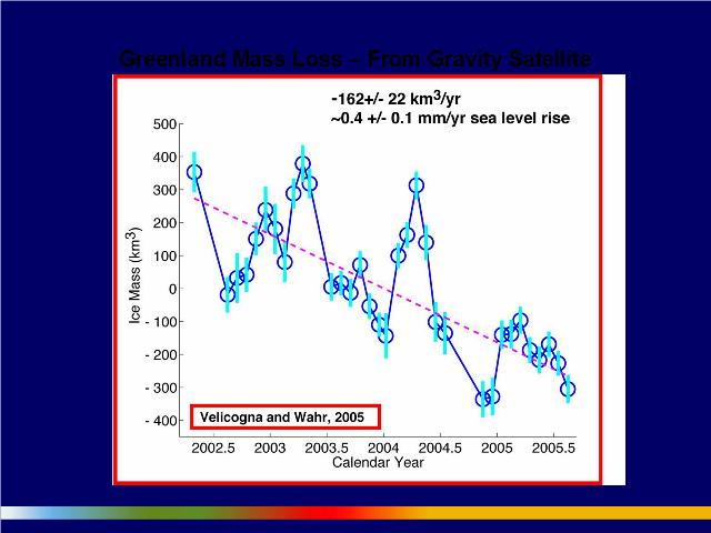
The issue here really relates to sea level rise and the rapidity of the potential melting of Greenland and the west Antarctic ice sheet. Just to give you some quick figures, what we are talking about: If Greenland were to melt entirely — and nobody is saying that is going to happen fast — we would see sea levels arise about 7 metres (7.66 yards). If the west Antarctic ice sheet were to melt entirely, sea levels would go up about 5 metres (16.40 ft). If the rest of Antarctica melted, it would go up another 55 metres or so. The total in all three areas is around 70 metres.
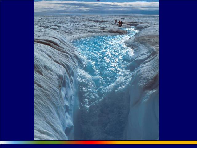
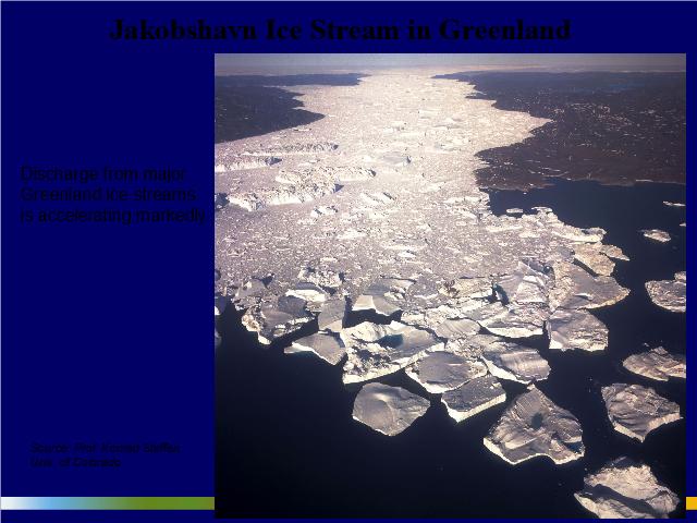
Concern is about what’s happening in particular in Greenland and the west Antarctic ice sheet. Here is an image of Greenland:
Because there has been a rethinking of the nature of ice sheet melting over the last few years — again, one that’s not reflected in the IPCC reports… The IPCC estimate of sea level rise, which is 20 cm (7.87 in) to 60 cm (1.97 ft) this century, is largely based on what are called static ice sheet models. In that case, they’re basically assuming if you have warmer atmosphere over the ice sheet, the ice sheet melts. You have water accumulating on the surface of the ice sheet that runs off the surface and down into the ocean.
But it turns out as the ice sheets melt and warm, they start to develop cracks. These cracks can become very large. They’re called moulins — that’s one in Greenland — and very substantial quantities of water flow down those cracks to the base of the ice sheets.
A number of things may happen at that point. One thing that people are concerned about is that water will help lubricate the movement of glaciers and ice sheets much more rapidly into the ocean. There is a debate about whether that’s happening or not.
Another thing that gets less attention, though, is that these millions — perhaps hundreds of millions — of tonnes of water are taking enormous amounts of heat to the bottom of these ice sheets, which essentially means they are melting from both the bottom and the top.
There are a bunch of other things we now realise about the dynamics of ice sheets that weren’t incorporated in the IPCC reports. So the consensus in the scientific community about sea level rise has changed substantially.
Even when the Working Group One report was released at the beginning of last year, ice sheet specialists came out and said the 20 cm (7.87 in) to 60 cm (1.97 ft) estimate is way off the mark. Now you hear a consensus that we are looking at least a metre this century and possibly 2 metres (6.56 ft).
James E. Hansen of NASA-Goddard has recently written that if you look at the paleolo-climatological record that goes back many millions of years and look at episodes where we believe sea level rose very fast, there is evidence that the sea level has risen in a number of case at a metre every 20 years. That’s because when these ice sheets start to go, they start to go really fast. It can be a process that is fundamentally non-linear — again, a kind of flipping process. Our assumption that we are going to move in a nice incremental process into the future for many centuries when it comes to ice sheet melting is probably unwarranted.
Now, even if it’s 2 metres (6.56 ft), which I think will probably become the consensus estimate within the next ten years or so, that is still an extraordinary change in sea levels. We are building new residential areas in places like Delta and Richmond and the West Coast. We are rebuilding port facilities in Victoria and Halifax. The whole Vancouver airport, by the way, is already essentially under sea level. These are areas, with a two-metre sea level rise, that will probably have to be abandoned. There are major cities in the world where, with a two-metre sea level rise, you start to question their viability: London, large parts of Manhattan, Rotterdam, Amsterdam, not to say many, many cities in the developing world. These costs have not been incorporated into our estimates of the consequences of climate change for the most part because those estimates usually take at face value the IPCC estimates of a 20 to 60 cm sea level rise. 33:56
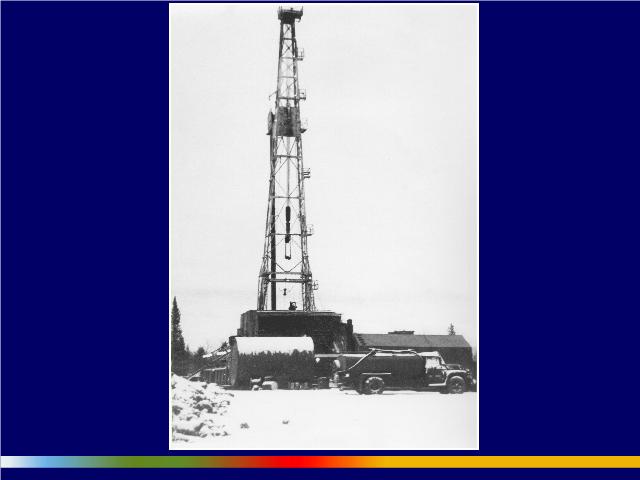
We need to recognise just how anomalous the last 150 years have been in human history. And by the way, Canadians should be a little bit proud of this perhaps, perhaps not, but the commercial oil industry began in Oil Springs, Ontario, exactly 150 years ago. It did not happen in Titusville, Pennsylvania, in 1859. It happened in Oil Springs Ontario in 1858. The gushers there were so prolific that they produced oil that flooded the ground up to a yard thick. The oil flowed into lake Simcoe and down into the St. Lawrence river system and fouled boats as far away as Kingston.
During the last century between 1900 and 2000 the human population quadrupled in size. We increased agricultural output four-fold — I should say yields per hectare, agricultural output per unit land four-fold — during that time. We increased energy input per hectare 80-fold — for mechanisation, fertilising, irrigation, transport and the like. A very large fraction of the human population would not be here if it weren’t for petroleum. Every time you fill your car gas tank, you are putting the equivalent of two years of manual labour into your gasoline tank. Three tablespoons of crude oil contain as much usable energy as is consumed by a manual labourer in two days.
This is really remarkably good energy. It is in some ways probably the most versatile and the most dense, in terms of its energy density, energy that human beings are ever going to have available to them. And we have just ripped through it in a blink of an eye. Now we’re going into new period and we know we’re going into a new period because of data like these:
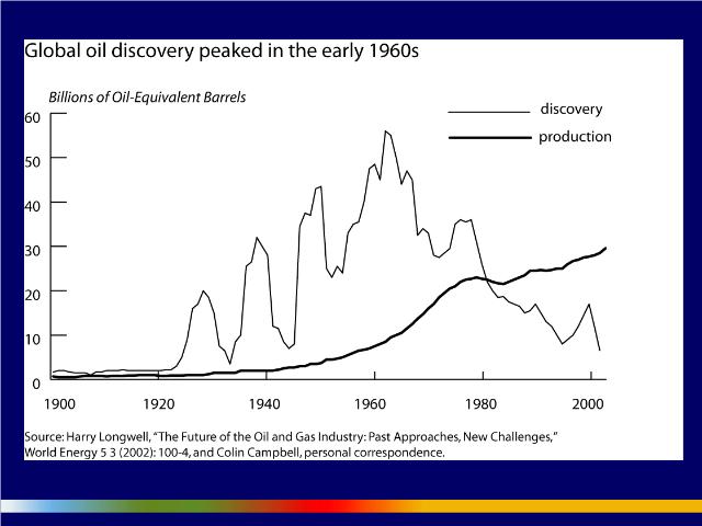
What we’re looking at here are two curves, or two plots, in time — 1900 to 1905 — here, from 0 to 60 billion barrels of oil equivalent. The lighter line represents global oil discovery — which peaked, as you can see, around 1964 at around 60 billion barrels of oil and it has declined more or less steadily since then, with a reversal in the 1970s when the North Sea fields and the North Slope fields in Alaska were discovered and the North Sea fields in Europe. This dark line represents global oil production or consumption and it’s rising now at a rate of around 1.5 to 2% pretty steadily, largely as a result of the very energy intensive industrialisation in India and China, as we heard earlier this afternoon.
But the thing to notice, of course, is this gap over here — this yawning gap between production and consumption and discovery. On an annual basis, humankind around the globe is consuming around 30 billion barrels of oil, but we are discovering, on an annual basis, when we talk about conventional oil, somewhere between 3 and 5 billion barrels. So on an annual basis we are consuming somewhere between 5 and 10 times as much oil as we are discovering.
Now, we can do that for a while because we are able to consume oil that we discovered a long time ago, but eventually this dark line is going to peak and start to decline. It’s hard to say when that is going to happen. There’s some evidence it’s starting to happen now. That may be one reason that despite the fact that the United States economy is static or declining, energy prices, oil prices, have stayed high. That’s a very unusual phenomenon, by the way. In every other case, when the United States has entered a recession, oil prices have started to decline.
There is a lot of evidence of significant supply constraints in global conventional oil supplies. Now, conventional oil provides 40% of the world’s commercial energy and 98% of the world’s transportation energy. It’s the stuff that the global economy literally runs on.
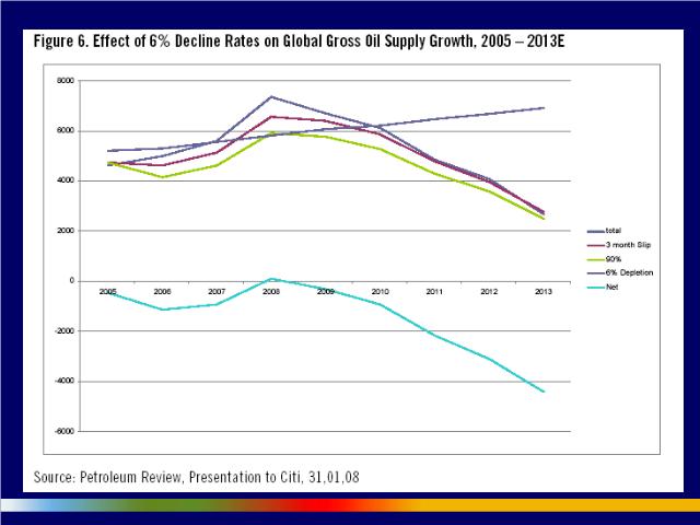
But aren’t there a lot of other oil fields out there? Well, CitiGroup, an energy analysis group at Citi, recently basically analysed all the potential fields that were coming online, 175 of them, between 2005 and 2013 and tallied up the potential production from those fields and extrapolated it out through time. The total is this line here.
What you’re looking at: This is from 2005 to 2013 and here the zero point represents 85 million barrels of production per day — which, by the way, is where the world’s oil production system has been stuck for the last 2½ years. We haven’t seen any increase above essentially 85 to 86 barrels of oil for 2½ years — another very unusual situation.
 |
| place holder global warming slide |
If we bring all these 175 fields online and assume that they’re going to be three months late — that’s the red line — and assume they’re only going to produce 90% what they’re predicted to produce — that’s the green line — then this is the amount we’re going to be able to add, this green line, to that 85 million barrels a day. So, another 4 million barrels, 5 million barrels, in 2008. Actually, excuse me, that’s 6 million barrels 6,000 times 1,000 — 6 million barrels plus the 85 million barrels a day.
How much do they decline? Well, it’s not clear — somewhere between 4 and 6%, maybe even higher, a year. There is a lot of debate about this.
This is the line of decline, that line there, increasing over time as we go out. We’ve got to replace in this case 5 million barrels, now up to 7 million barrels, a day of production because of the decline of existing mature fields. If you subtract this line every year from the green line, you get this — which means that in 2008, according to that estimate, we’ve peaked in global oil production.
Now, who knows? We are in the middle of a grand global experiment and we will find out pretty soon whether global conventional oil production starts to decline. But a lot depends at that point on the rate of decline. If you look at mature oil fields around the world, the rates vary from between 3% and 15%. The average, according to Schlumberger, an oil field service company, is around 8%.
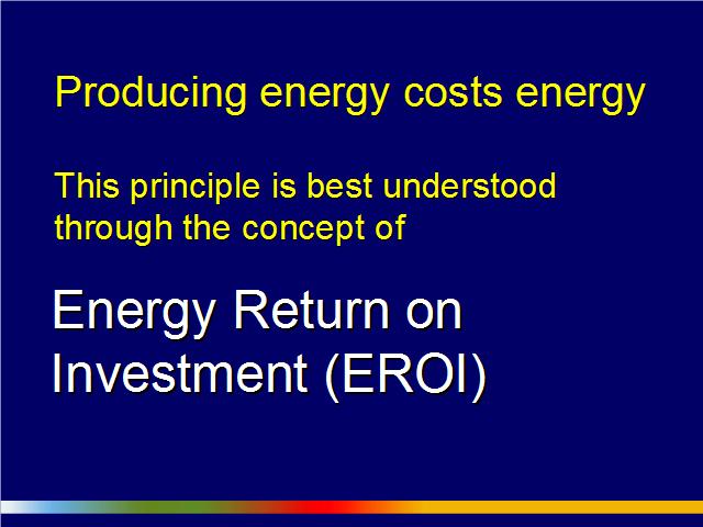
If we decline globally, once we pass peak production, at 3% a year, we might be able to compensate by ramping up tar sands, nuclear, renewables, conserving more, etc. But if global oil production starts to decline at 8% a year or higher, the kinds of price increases that we’ve seen for petroleum so far are going to seem like a cakewalk compared to what we’re going to see in the future. 41:53 Now, the critical issue here is what specialists call the energy return on investment. This is the amount of energy you get back for the amount of energy you invest to get energy. I find it a particularly useful concept. 42:04
In the 1930s in Texas, drillers got back around 100 barrels of oil for every barrel of oil of energy they invested to drill down into the ground and pump oil out. In the United States now, for conventional oil they get back around 17 barrels of oil for every barrel of oil of energy they invest. The tar sands in Alberta have an energy return on investment of 4:1. Corn-based ethanol has an energy return on investment of probably less than 1:1. It’s a great subsidy for farmers, but it’s a terrible energy technology. 42:36
If you look at all the energy sources in an economy and aggregate them all together, as we slide down that slope from 100:1 to 17:1 to 4:1 towards 1:1, we’re using a larger and larger fraction of the wealth and capital in our economies simply to produce energy and we’ve got less left over for everything else we need to do, including solve our increasingly difficult problems. 43:02
Now, we’re going to need a lot of energy to solve problems like climate change. We’re going to have to, quite possibly, move populations away from coastlines, rebuild coastal infrastructures, pipe water from newly wet areas to newly dry areas, drill deeper for water, desalinize water along coastlines and we’re going to have to pump billions of tons of carbon dioxide underground. 43:30
And all of that is going to have to happen right at the point where we’re making this transition from a world of abundant cheap high-quality energy to a world where one of our most important energy sources is becoming much more expensive energetically, in terms of the amount of energy that we need to get it. Because what we’re finding with oil companies and oil explorers in general is that they’re having to go further into more hostile environments to drill deeper to find smaller pools of lower-quality oil. 44:05
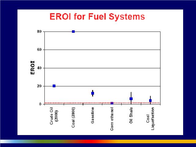 Now, there’s a punchline to this and the punchline involves the comparison of
EROIs for different fuel systems. Here we have crude oil for the globe, about
20:1; corn ethanol, as I said, around 1:1; oil shale and tar sands, somewhere around 4:1 or 5:1; coal liquifaction, diesel from coal,
about 2:1. But look at coal — coal, around 80:1. Even though the price of coal has risen sharply in the last few
months, you still get an enormous bang for your buck at the margin in terms of the energy
return on investment. 44:43
Now, there’s a punchline to this and the punchline involves the comparison of
EROIs for different fuel systems. Here we have crude oil for the globe, about
20:1; corn ethanol, as I said, around 1:1; oil shale and tar sands, somewhere around 4:1 or 5:1; coal liquifaction, diesel from coal,
about 2:1. But look at coal — coal, around 80:1. Even though the price of coal has risen sharply in the last few
months, you still get an enormous bang for your buck at the margin in terms of the energy
return on investment. 44:43
And what this mean? It means that as it has become more expensive, both in terms of price and in terms of energy, to get oil, you’ve seen a shift to more carbon-intensive fuels like the tar sands and especially coal by utilities, by whole economies and by companies. The result is that we’re increasing much more rapidly than expected our carbon emissions globally. This is the important relationship between energy and climate that I wanted to discuss here today. 45:15
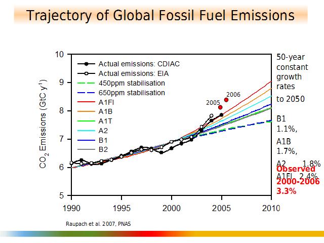
What are we looking at? We have a carbon emissions graph from 1900 to 2010 across the bottom. And here we have billions of tons of carbon, from 5 gigatonnes (5.51 gigatons) tons to 5 gigatonnes (5.51 gigatons), gigatonness of carbon or billions of tonnes of carbon per year. In the back we have a series of smooth lines which represent IPCC emissions scenarios — here are the labels for the scenarios right here — from relatively optimistic to pessimistic. The A1-F1 scenario, the red line on top, is the most pessimistic. Laid over the top are the results of two different metholologies identified here that gauged actual global carbon emissions. 45:55
Now I’m going to show you the second jaw-dropping piece of data that came into the scientific discussion in this case last October. So, 2006 carbon emissions were announced in October and came in at 8.40 gigatonnes (9.26 gigatons) of carbon, well above what scientists were expecting and almost ½ gigatonne (0.55 gigaton) above the worst-case IPCC estimate. Between 1990 and 2000, global carbon emissions increased at a rate of 1.6% a year. Between 2000 and 2006, in significant part because of a rapid increase in oil prices and a shift to coal, global carbon emissions started to increase at a rate of 3.3% a year. That’s a doubling time of 20 years. We’re going in diametrically the opposite direction of where we should be going. 47:00
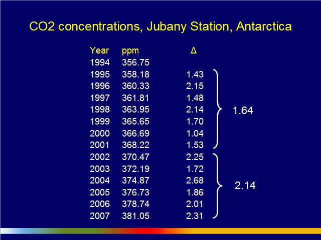
And we can see the result in the increase in the annual increment of carbon dioxide in the atmosphere — CO₂ concentrations in parts per million, by volume.
At Jubany’s station in Antarctica — this is a joint Argentine and Italian research station — you can see that at just about the time that we saw a significant jump in petroleum prices, we also saw a significant jump in the average annual increment of carbon dioxide. Most specialists say that this number here, which last year was 2.31 parts per million, is heading towards 3 parts per million annually. 47:31
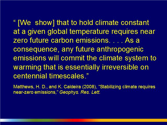
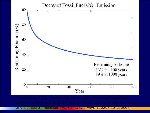
While this is happening, while we find evidence that we’re going in the wrong direction in terms of our mitigation of carbon dioxide, we’re finding also that climate scientists are coming to the conclusion that carbon dioxide is resident in the atmosphere a lot longer than we thought. In fact, it turns out, about 25% of the carbon dioxide that we emit will be resident in the atmosphere 1,000 years from now. And for a number of reasons, including that one, senior climate scientists are starting to conclude that we don’t need to cut 50% or 80%. We have to go to zero. We have to zero out carbon in our economies as quickly as possible. And that’s the content of this particular quotation that appeared earlier this year in a scientific article. 48:17
That brings us to an issue that some of us are starting to talk about in conversation with a number of researchers down in the States, which is what we now call — using the American pronunciation of zed — Plan Zee. There are different Plan Zs for getting to zero carbon emissions. 48:34
A critical independent variable or factor that differentiates between the various Plan Zs is the rate of ramp-down once we peak in carbon emissions and start to move south globally.
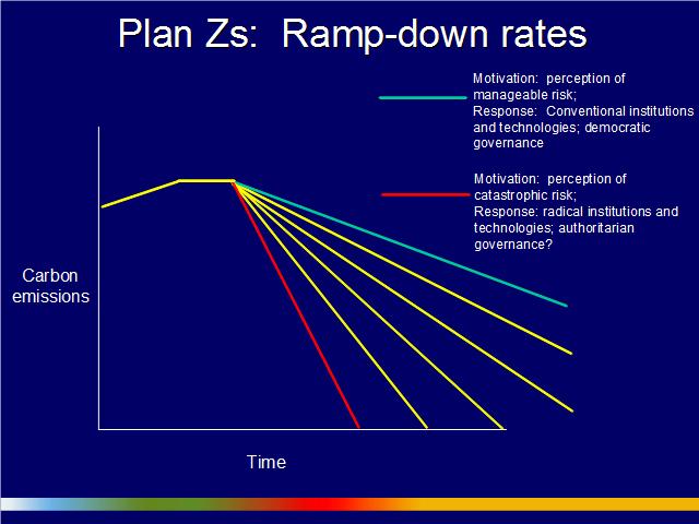
We hope we’ll be on a green line. In this case, the motivation is the perception of manageable risk and the response involves conventional institutions and technologies and democratic governance. 49:00
But it’s quite possible that we might find ourselves on something like the red line if, for instance, 10 or 15 years from now we start to see evidence of a rapid disintegration of the ice sheets. In that case, the motivation will be a perception of catastrophic risk. The response will involve radical institutions and technologies. It will be something more akin to a war mobilization of human and financial capital. That’s what a lot of climate scientists are starting to talk about now. And in those cases when you try to turn the economy rapidly, invariably it has political and social consequences and may, unfortunately, involve something along the lines of a more authoritarian government. 49:40
Now, this may sound astonishing, but I want to tell you that those carbon emissions figures that we’re seeing — and watching what’s happening in places like China and India and the lack of progress in places like the United States and Canada — have not only convinced scientists that we may face an emergency situation in a relatively short period of time, but that one of the potential responses to this climate emergency may well have to be geo-engineering. That’s the intentional modification of the planet’s climate — in particular, to cool the poles, perhaps by dumpling large quantities of sulfate aerosols into the atmosphere to change the reflectivity of the atmosphere over the poles and cool the poles as rapidly as possible. 50:22
There are very vigorous discussions now going on by scientists around the world about how this might be done. These are people who wouldn’t have touched this issue with a 10-foot pole even three years ago because they’re appalled by the prospect. Almost without exception, they regard the fact that they’re having to have conversations about geo-engineering as evidence of a colossal moral failure on the part of humankind. But they now think that we have to start doing the research, at least because the consequences of not being ready, if it turns out that the poles are warming very fast and we get into this kind of positive feedback situation that I’ve been talking about, might be truly terrible. 50:56
In fact — and this is the last point I’m going to make before I make a few remarks about the situation of Canada in these circumstances — many senior climate scientists are going even further yet. They’ve come to the conclusion that we’ve already passed the danger threshold and that we need to move back from somewhere in the neighbourhood of 380 parts per million, probably to 350 parts per million. In other words, not only do we need to zero out carbon emissions, but we need to reduce the amount of carbon in the atmosphere. 51:30
There are a number of possibilities for how we could do that. Astonishingly enough, if you get a price on carbon above $100 per ton, it probably starts to pay — if you can find the right energy source — to build large plants to suck carbon dioxide out of the environment, out of the atmosphere and start to pump it underground. It would actually be a money-making venture. 51:48

This<350 — remember this number for the rest of your life — is the headline on an ad that is going to appear in the New York Times, the International Herald Tribune and the Financial Times this coming Monday, signed by 350 climate scientists, commentators and advocates (I’ll be somewhere in very small print on that list) who are suggesting, in line with James Hansen, that we need to start thinking, at least as a target, about 350. And James Hansen, on the same day, will be testifying in front of Congress. That’s the 20th anniversary of that famous testimony in 1988 where he declared, to great skepticism, that anthropogenic climate change was already noticeable in the year-by-year variation in the climate. 52:35
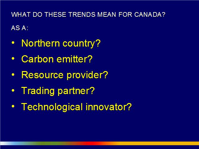
So what does this mean? What does all of this mean for Canada? I’m actually going to go through this fairly fast because I got the impression from the conversation — the really excellent conversation that I listened to before — that many of these points have been covered. But some of them have not, so I’ll just highlight a couple of points that I think are new. 52:55

What do these trends mean for Canada, as a northern country? Well, as I said before, because we’re a northern country and because these positive feedbacks are much more powerful in the north than they seem to be elsewhere on the planet, we are going to be affected much more significantly by climate change than most other countries. People think that because we’re a cold country, it’s not going to be bad news if we warm a bit. But getting out beyond, say, a decade or 15 years, during which we can enjoy lower heating bills and maybe pleasanter springs and summers — except for the midsummers, where we’re liable to see more extensive heat waves… Getting out beyond that period of time, keep in mind that Canada is going to warm twice as much and twice as fast as just about any other region of the world that has a northern country. This is going to have stunning effects on our forests, on our cropland, on shipping that depends upon water levels — for instance, the St. Lawrence Seaway — on urban water supplies and on the habitability of our cities. I could go on about that, but I’m sure that you understand the general implications. 54:00
What are the implications for us as a carbon emitter? Well, we’ve heard about the tar sands. The tar sands are a really big contributor to Canada’s carbon emissions. They may actually be in considerable economic trouble if some of our trading partners adopt low-carbon fuel standards and I know you’ve heard about that. 54:22
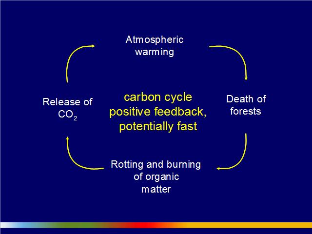
But Canada has been making certain assumptions about the way its biosystems, ecologies and natural systems are going to respond to a warmer climate. In particular, there have been assumptions about the releases of carbon or the absorption of carbon from certain parts of our ecological and natural systems. A warmer climate may start — in fact, it already seems to be starting — melting the permafrost, which could be a very large source of methane, of positive feedback emitted from the permafrost that would reinforce climate change. 55:00
And as we know, a warmer climate affects forests, in many cases negatively. In areas as diverse as Europe, Southeast Asia and also in Canada, warmer climates are starting to negatively affects forests, in part because, as we’ve seen in British Columbia, of the increased prevalence of pine bark beetle. 55:17
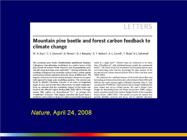
The rotting and burning of the organic matter in those forests can lead to great releases of CO₂. We haven’t talked very much in Canada about the implications for Canadian carbon emissions of the death of the pine forests in BC — about 70% dead now. But this article that appeared just recently in Nature suggested, or argued — and did the calculations to support the argument — that between 2005 and 2020 the loss of pine forests in BC will turn the forests in BC from a net sink for carbon into a net emitter of carbon — almost a billion tons of carbon dioxide, which is about 5 times the annual emissions of Canada from its entire transportation fleet. 56:05
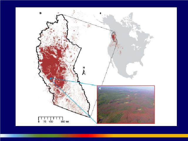
There is concern that these pine bark beetles may get across the Rockies and into the boreal forest, which is one of the largest storers of carbon in the world.
So we probably shouldn’t be counting our forests in the calculations of Canada’s carbon sinks because their viability in a warmer climate is very much open to question. 56:30
What about as a resource provider? Well, Canada provides a lot of resources to the world, as we all know. You’ve heard conversations about Canada as a resource provider of energy and we potentially could provide water in large quantities to the United States.
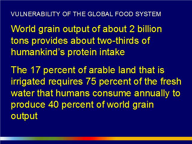
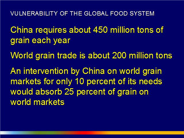
I just want to give you a little sense of how vulnerable the global food system is, especially to shifts in water availability. World grain output of 2 billion tons provides about 2/3 of humankind’s protein intake and the 17% of arable land that is irrigated requires 75% of the fresh water that humans consume annually to produce 40% of world grain output. It’s a tightly integrated — at least when it comes to grain — world food economy. 57:50 China in particular is a huge actor and requires about 450 million tons of grain a year. World grain trade, though, is only about 200 million tons. An intervention by China — let’s say 20%… If its grain output falls 20% simply because of, say, climate shocks — perhaps the ones that are happening right now, since large grain producing areas are flooded — that would absorb 50% [of world grain]. If there were a 20% shortfall, that would be about 90-100 million tons of grain. If China intervened on the international market for 90-100 million tons of grain, that’s about 50% of the world grain availability. Can you imagine what that would do to grain prices? 58:39
Now, Canada, one way or other, is going to be involved in this food story because we’re a big food exporter. Don’t assume that just because the climate’s getting warmer, we’re necessarily going to be able to grow a lot more food and a lot more grain to export to the world. It’s possible; carbon dioxide fertilization might produce larger crops and allow us to export more. But we have to remember that we need rain, too and we need good soils. And one of the things that’s predicted to happen for many of the grain-producing areas in Canada is that they’re going to dry out, especially in the interior of the continent. 59:15
A few comments just very quickly on Canada as a trading partner. The critical policy instrument here, the institutional change that has to be made, is that we need to get a price on carbon, as I’m sure many other people have stressed. But we have to make sure there’s a harmonization between whatever policies Canada adopts and what is going to be adopted by the world. I would expect that probably, with a new American administration, we’re going to see rapid movement at least of North American cap-&-trade system and that will begin a very aggressive discussion of carbon prices for the whole world. That’s the most important thing we can do, if we want to get markets pivoting so that they actually focus effectively on this problem and get entrepreneurship released around the world. 1:00:00
And then we come to technological innovation, Canada as a technological innovator. Here’s where I’m most discouraged because a few years ago we were arguing that Canada had enormous opportunities to move on energy and climate issues and be at the forefront of innovation with things like carbon capture and storage. Because it turns out, for example, that Alberta is geologically and geophysically just about one of the best places in the world to exploit CCS, along with hydrogen production and deep coalbed methane and a whole suite of technologies that could be coupled together that we could then turn around and sell to the world. And we’ve dithered away and now we’re going to have a new administration in the United States that will start pouring tens of billions of dollars into this research and Canada, very likely, at that point will be bringing up the rear. 1:01:00
There are potentials still for real game-changing technologies here that could revolutionize energy production, such as — again, in terms of Alberta — underground coal gasification. This is basically producing syngas in quantities from coalbeds that are too deep to mine. It’s a technology that was originally developed in Kazakhstan by the Soviets and is now being tested in Australia and South Africa. You can pull the syngas out, extract hydrogen and pump the carbon dioxide back underground, and make it actually not disruptive at all to the surface environment and, in terms of carbon emissions, almost entirely green. Now, that is potentially a game-changing technology. If it works out properly, it turns out that Alberta in just certain areas has such enormous deep coal beds that could be exploited in this way that it could provide syngas for enough power, enough energy, to drive the economy of a large part of North America. 1:02:00
And then there are technologies like enhanced geothermal. I was just down in the States talking to some people who are working with Harvard for its new campus in Austin. They are going to drill down 6.44 km (4 miles) to 9.66 km (6 miles) below the surface of the earth, fracture the rock, pour water down there and bring very hot water up to the surface to drive electricity turbines. Canada would be well served if we focused our resources, took one or two of these technologies and really tried to run with them because we need to be well positioned in a world that’s going to rapidly change. 1:02:45
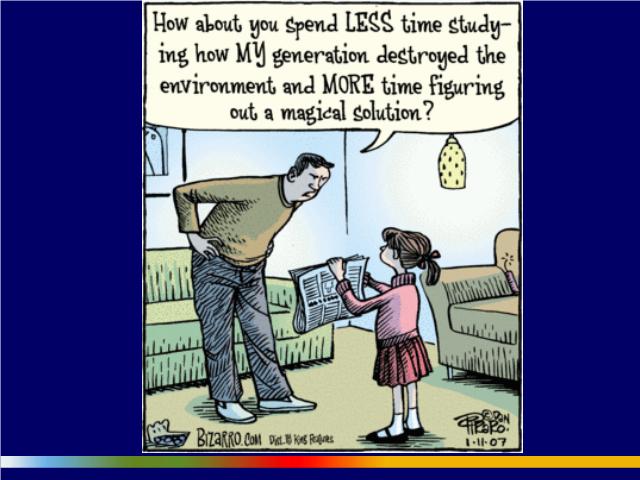
That brings me to my last slide. You have a father saying to his daughter, How about you spend less time studying how my generation destroyed the environment and more time figuring out a magical solution? I think in many ways that characterizes our approach to this problem. There has been an unbelievable, staggering lack of foresight, vision and political courage, particularly at the federal level, when it comes to this complex of issues.
You know, we can argue about Stéphane Dion and what he’s done, but at least he’s had the guts to get out there and propose a real policy that pushes the edge of the envelope. There’s an enormous gap between what we should be doing and what we’re actually doing. And in many ways the problem is really about our kids. I had mentioned earlier that I have two little kids at home. They’re really young, and when my wife and I look at them, it‘s like we’re looking through a window 80 years into the future. It’s the most intimate connection with the future that I can imagine. We can’t really see what’s out there; it’s all sort of foggy. But we know enough about what’s going on to be worried that their generation and the subsequent generation may be the first in a long time in wealthy countries that actually have less opportunity to flourish than we have enjoyed. 1:04:04
But there’s also real reason for hope there because one thing we can say is that if you go around the world and across all the divisions of race and ethnicity and language and caste and class and even divisions among civilizations, the one thing that’s true is that everybody cares about their kids. And actually they want something more or less similar for their kids. Parents don’t want enormous amounts of stuff for their kids in the future. They want a future that’s safe and secure for them and offers them the potential to flourish and to develop. Well, if that’s true, then there’s real hope. It might be that these challenges actually, for the first time in human history, force us to start thinking about the enormous divisions among us and start to pull together and solve our common problems. 1:04:57
The one thing we do know — and that’s the point of this cartoon — is that if we don’t get going on these problems fast, if we wait 15 years and hand the problems over, hand the baton over, to Ben and Kate and your kids at that point and say, Sorry, we made a mess of things; it’s time for you to fix it up? — the problems are going to be too hard to fix. And they’re getting harder every day we wait.
Thanks very much.
[Applause.]
Now, we went a bit longer than I was expecting, but I gather that we can go a little bit past 5:00. If you have to go, please feel free, but I’m supposed to moderate the questions, so let’s have 5 or 10 minutes of questions.
I’ll just give you one thing that sort of hinted at this in my mind. I was in Brisbane last August and September. When I arrived, I was told that the reservoirs there at that point had only 17% of the normal water level in them and that they couldn’t even use the whole 17%. Now, since then there have been some rains and I think Brisbane is a little bit better off. But there’s a really serious drought in Australia. I asked the person I was talking to, What happens when Brisbane runs out of water?“, and she said, “I don’t know. 1:08:20
One of the really big symbolic things in the world, I think, is going to be the first time a major industrial wealthy city runs out of water. It could be Brisbane; it could be Atlanta; it could be Barcelona. I’m making a little list. It may turn out in the end that rich industrial, highly complex and energy- and resource-intensive societies are going to suffer very substantially from these problems. All their wealth may not actually in the end help them that much and it might even make them more vulnerable. 1:08:55
All the same, subsistence people in Africa and marginal people in many places in the world, especially those in cities, are going to be hurt very badly by these combination of problems. I don’t want to diminish that at all. 1:09:04
On the contribution side, however, those populations, for the most part, are contributing very little. The big actors at this point can be sat around a table about that size. If you put 7 or 8 countries and Europe there, too, around a table, you can get 60-70% of the world’s emissions into a negotiation of some kind. The two most important ones are China and the United States. Between the two of them, they increase over 40% of the world’s carbon dioxide. 1:09:35
Now, I think what happens in the American election and the relationship between China and the United States after the American election on climate change issues, is absolutely critical. Most people think that China is just not going to do anything and it probably won’t until the Americans introduce a serious climate policy. But a lot of people think that China is still going to drag its feet. 1:09:55
But here’s the difference: as they’ve become the largest emitter of carbon dioxide in the world and as they’ve become more obviously vulnerable to climate change, they start to have increasing incentive to actually do something about their own emissions because their own emissions are hurting them directly. Now, I think the Chinese are going to recognize this at some point. They’re going to stop saying, You fix the problem and we’ll wait until you start, or Clean up your mess and we should be able to continue emitting. They’re going to realize that they’re going to have to do something about their emissions because their food supply is at stake. 1:10:30
The silver lining in terms of a political deal may well be the incentive for China to join the discussion and the change in leadership in the United States. Things could happen very fast. You get China, the United States and a few other actors involved in setting up a global carbon regime and it’s going to become increasingly difficult for other economic units to not participate.
That’s not a complete answer to your question, but at least it begins to touch on some of the things that I would say if I had more time. 1:11:00
Henry Lowe:
Dr. Homer-Dixon:
I was just at a debate yesterday with some specialists — these are people who follow the oil markets very carefully — who talked about these prices are starting to get us into a range, especially with the removal of subsidies, where we’re actually going to see a significant flattening out of demand. But the question then is: is the demand going to be softened or reduced enough to compensate for the fact that supply restraints some to be becoming more severe? 1:13:10
I think it’s an open question. If I were a betting person — and I said five years ago that energy prices are going to go up a lot over the next period of time — I think we’re getting into a territory where we’re going to see demand soften. And that might actually reverse the increase in energy prices so that we go down into the $110-$120 range, or something like that. It might even drop below $100. But the long-term trend, as economies compensate and start to grow again, is consistent upward pressure on energy. So getting rid of the subsidies is a big first step, but it’s only a first step and the road is probably 1,000 steps long. 1:13:45
My question to you right now is… It appears to me — and this is why I believe so very much in the United Nations — that we have to have global solutions to global problems. So I hope that humanity is going to both decide to get rid of war, which is essential and decide to have a habitable planet. And we have to work on this, I believe, through the United Nations. I would much appreciate your comments on that. 1:15:15
We are an obdurate species and I don’t think that this is going to be a smooth, easy process that we get through, if we end up in a reasonably good place. It’s going to be very messy, It’s going to be very inefficient and it could be potentially quite violent. But I think we need to make a distinction — to address your question directly — between government and governance. We potentially could have global governance without a global government in the form of, say, a World Federalism system, or world federation. We might eventually end up with something like a world federation, but I don’t think that’s what we need to assume is the ultimate end-point right at the moment. But we certainly need much better governance because what governance is about — and government a lot of the time, too — is dealing with collective action problems, where you’ve got public goods you need, like a fire department, a police department, a defence department, sanitation and things. And the only way you can really do it, to overcome the free-riding problem that affects all large groups of people, is to have some set of institutions that cajole and coerce people into actually doing something that they know underneath it all is actually pretty good for them. The trick, I think, is: how do we do that without necessarily creating an enormous, encumbering bureaucracy that spans the planet? 1:17:10
Now, if we set up a global cap-and-trade system, there’s going to be an enormous, encumbering bureaucracy for at least that portion of the project. To get a global price on carbon, you’re going to have to have financing mechanisms, verification mechanisms, monitoring and mechanisms for punishing those who don’t abide by the rules of the road. That’s going to be probably the most complex set of institutions that human beings have ever created. But it doesn’t mean we need to create a whole bunch of other ones in one macroglobal government, the way people used to envision, say, 50 years ago. About the same time as the Pugwash Manifesto was issued, there were people like Clark Anson [???] who suggested we needed a global government. 1:18:05
It may be that what we end up with is sort of a piecemeal proto global government, and a lot of governance in between by NGOs, by specialized agencies and things, that allow us to muddle through and do the job and create as much space for freedom and diversity as possible on the planet. I’m not a really eager institution builder. I really believe in innovation and space for freedom and diversity. But there are some places where we really do have to invest in institutions and getting a carbon price is the most important one, I think — the most important one in place. 1:18:41
Now, as for war and things like that, there are some who would argue that the trend is in a positive direction on those issues anyway. If we can continue improving the development prospects of humanity, I think problems of war will gradually wane. What is really a concern about the way we’re handling these challenges of energy is that we’re now going to see, probably in this year and the next, a turnaround, for instance, in malnutrition on the planet, which has been falling steadily, in percentage terms as a portion of the human population, for a long period of time. And it may actually start to increase now. That will undermine the prospects for peace eventually.
So we’ve got really big challenges in front of us — again, material challenges, natural challenges. I’ll take this as the last one. 1:19:30
Dr. Homer Dixon: Are you sure it wasn’t the Freeman Dyson speech in the New York review of Books 1:20:20
I think, should the apocalyptic vision become one to act on, whether it’s right or not, time will tell. You’re saying time is extremely short and we have to act right now. We’d have to reverse everything we’ve done. There’s tremendous support for Kyoto in Canada, but not universal. But we’d say to the Chinese: We let you off Kyoto, but we’re not letting you off anymore because weGrsquo;re going to charge $100 a ton for your carbon as well. That has tremendous implications. And another…
Let me talk about natural gas first and then get to this larger point that you were raising. Natural gas is a very important fuel. You’re absolutely right that there has been a progressive decarbonization of human energy systems. As we’ve gone from wood to coal to petroleum to natural gas, we’ve released progressively less carbon into the atmosphere for every unit of energy that we’ve generated.
What is important is that in the last 6 years, that trend has reversed, in significant part because of this shift to more carbon-intensive fuels like coal that I talked about. 0:23:00
You’re right that as a fallback fossil energy source, gas is the best stuff we’ve got. So let’s stop using so much of it to do things like heat our houses — right? — where we can pump heat out of ground right under our houses using ground-source heat pumps.
Crummy energy quality in the ground. We need crummy energy service in the form of heat in our houses. It’s a low-quality form of energy. You use low-quality energy to produce a low-quality energy service in our buildings in the form of heat. And you use natural gas for the stuff that you really need it for — like producing electricity if you need peak power, for example — and use that as a transition fuel as we move towards a non-fossil energy supply. 1:24:10
So, natural gas — big thing. Let’s hope that it continues to work with shale gas; otherwise, we’re all going to be highly dependent on natural gas coming in great tankers from places like Russia, West Africa and the Gulf — places that we really [don—t] want to be dependent upon to heat our homes in Ontario and to power our generators. 1:24:40
In terms of your general question — which is really well-taken — is this too catastrophic a view? Well, in every one of your specific points, I can debate the data and the empiricals. By the way, I think Lomborg and others — including Freeman Dyson in the most recent issue of the New York Review of Books — make a fundamental mistake about the potential for non-linearity in the system. They tend to assume the mean result and they tend to assume that it’s going to be an incremental process of getting there. 1:25:07
But let’s put it this way — and it relates to the point I just made: Would we rather be wrong about the catastrophic potential of climate change and make a bet that it could be catastrophic and invest in trying to prevent it? Or do we want to be wrong in making a bet that it isn’t going to be bad and then 70 years from now we find that we’re in a situation of irreversible catastrophic climate change? It’s a slam dunk for me. 1:25:33
I think that there is a very strong argument. We could spend 5% of GDP (Gross Domestic Product) on this and if it ends up that we’re wrong, we’ll end up with a much more efficient and more equitable economy at the end of the process and probably a lot greener, with a smaller footprint on the natural environment. And if it turns out we’re right, then there’s going to be a future full of potential for our children, which there might not be otherwise.
Thank you very much.
[Applause.]


This page is posted |
http://mindprod.com/environment/hdenergy.html | |
Optional Replicator mirror
|
J:\mindprod\environment\hdenergy.html | |
Please read the feedback from other visitors,
or send your own feedback about the site. Contact Roedy. Please feel free to link to this page without explicit permission. | ||
| Canadian
Mind
Products
IP:[65.110.21.43] Your face IP:[18.216.114.23] |
| |
| Feedback |
You are visitor number | |